It’s been a while since I started this blog as part of my data
science bootcamp. Looking back at my little blog, it seemed
like I should either take it down or start using it again.
Since it’s NANOWRIMO month, let’s see if I can maybe get it going again?
Since this blog was born in a bootcamp, I thought a good ‘welcome back’
post might be how I look back on my bootcamp experience.
Things you should know before doing a data science bootcamp
Think of a bootcamp as “the icing on the cake.”
At the end of the course, you will be “whoever you were” (your cake)
plus “shiny new data skills” (your icing). Figuring out how to sell
that in the job market depends on your previous experience, what you do
during the training, and
how well you do the work of imagining your next life.
My fellow students with the clearest career goals got jobs faster (one
was even hired before she graduated!). I was probably fair-to-average
in that respect, but I knew that I didn’t know.
The main reason I chose the bootcamp I did was because I had a good
feeling about the career advisor. (Thanks for everything, Marybeth!)
Covid seems to have moved all of the in-person bootcamps
to online. I personally am glad that I did an in-person class.
The ability to practice giving presentations in front of a live
group was great pracice for both interviewing and for going back to work.
The casual face-to-face conversations in the break room with my
cohort and the staff were also important parts of the experience
for me. When you’re all working in a computer lab together, it’s easy to
ask the person next to you for help, while online you might not really a
sense of whether other folks in the room are having the same issue, or
if they are ok with being interrupted.
You will not learn all of data science in 12 weeks, but you will learn
a lot, and you will learn how to figure out “just in time” learning, which is
the only way to keep up with a constantly changing field.
Expect to have to continue to study afterwards to prepare for interviews and
to continue to grow on the job. But, also, once you’re away
from the experience a bit, you might appreciate it more than you do a week
after you graduate. At the end of the whirlwind of curriculum and
projects, it’s maybe easier to have a feel for how much you still
have to learn than to appreciate your accomplishments.
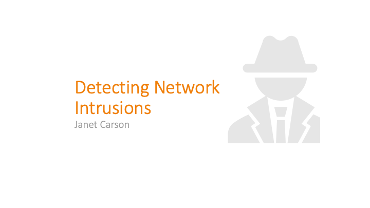
For my final project at Metis, I worked on a dataset for
detecting network intrusions.
By the end of the bootcamp, I was starting to get good at
designing a presentation PowerPoint… or at least at letting the
auto-design feature of PowerPoint design a presentation for me. My intruder looks
too well-dressed, though. Maybe he’s an FBI agent trying to catch the
hacker?
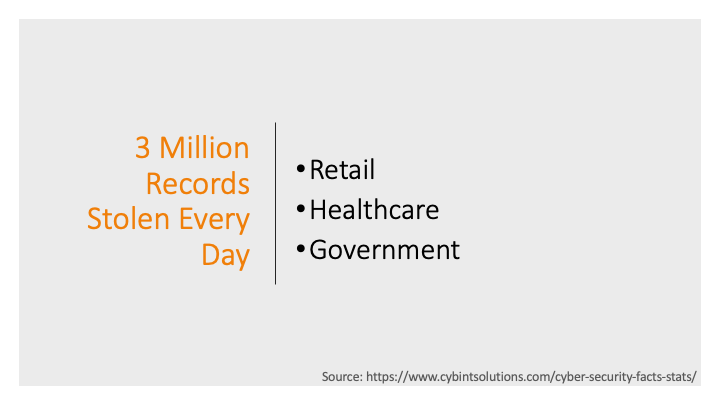
One of the key things the bootcamp emphasized was not to bog down
a general
audience with too many technical details, so I didn’t get into
TCP packet types and fields. I motivated the talk
with some examples of recent network breaches. There were/are
too many stories to choose from.
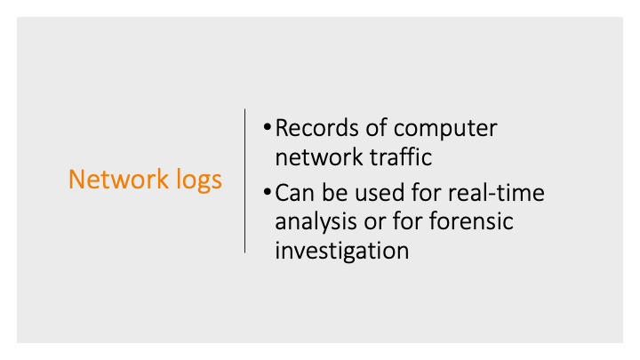
And explained generally what network logs were and where my data
came from.
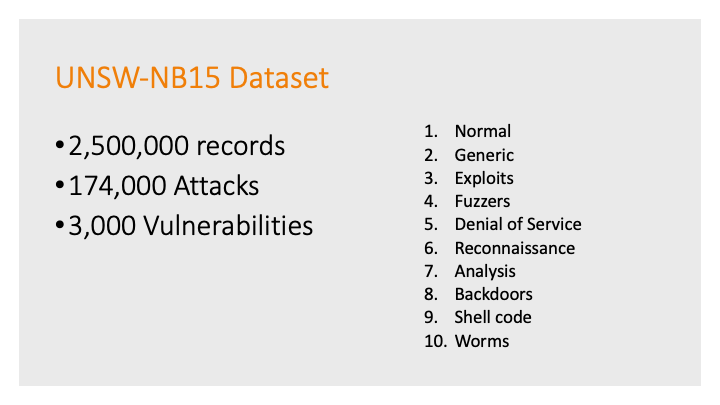
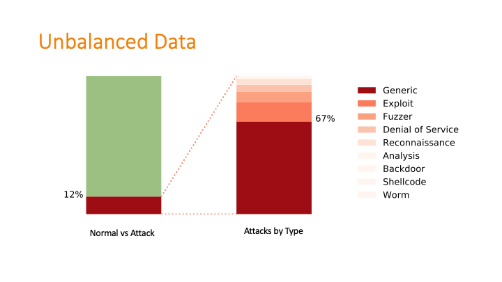
This was a challenging graphic to make with my
newly minted matplotlib skills! The dataset was twice-imbalanced.
The normal data versus attack data was imbalanced, and then
within the attack data, the types of attacks were also imbalanced.
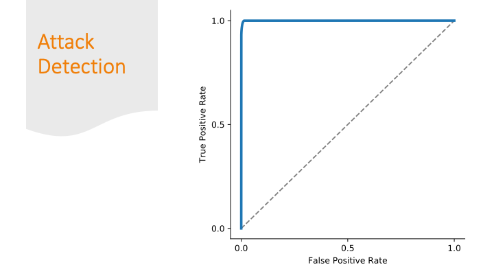
To deal with the imbalances, I used two classifiers: one that
separated attack from non-attack, then a second classifier took
the attack output and applied a label.
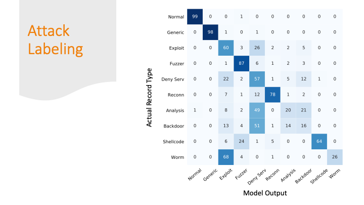
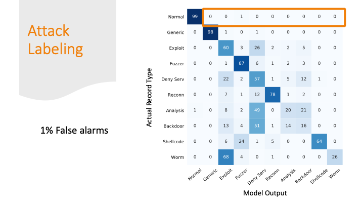
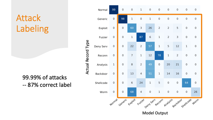
The advisors recommended not doing the confusion matrix
because it is overwhelming with so many labels, but I didn’t
really find a better way to summarize my results graphically.
So, I broke the matrix down over a few slides.
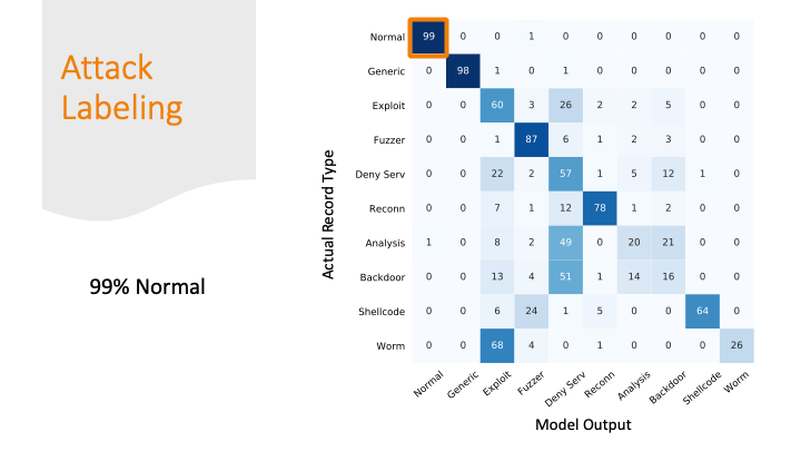
I was able to classify 99% of the normal traffic as normal traffic.
But I marked 1% of normal traffic as an attack. This sounds good
percentage wise, but if you think about the number of packets
flying across the internet every day, this would be a lot of false alarms!
The attacks were mostly labeled as some kind of attack, but
only 87% of the attacks got the correct label.
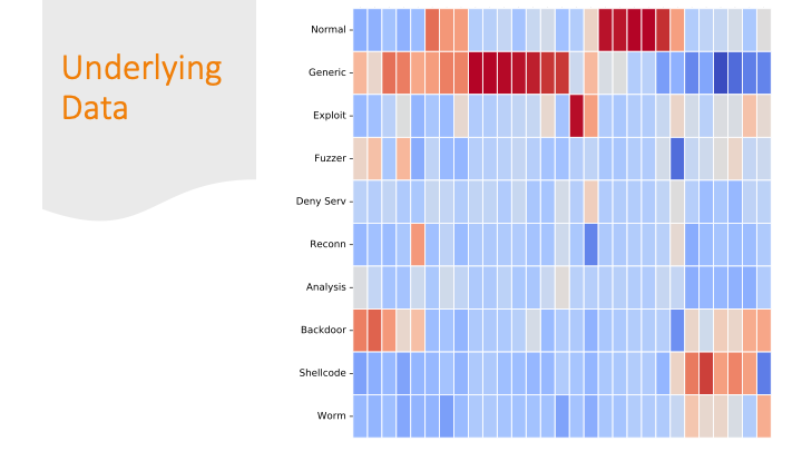
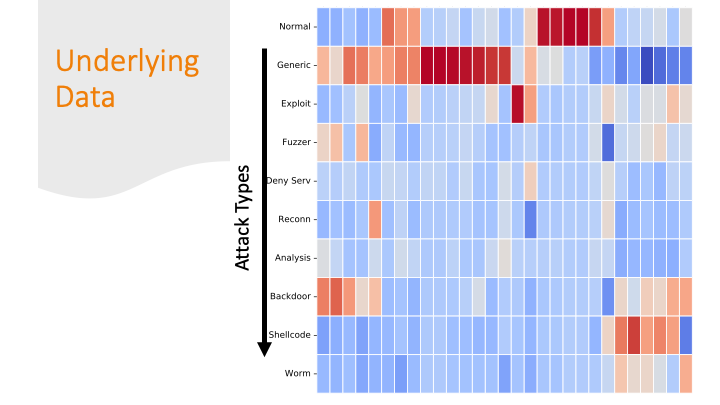
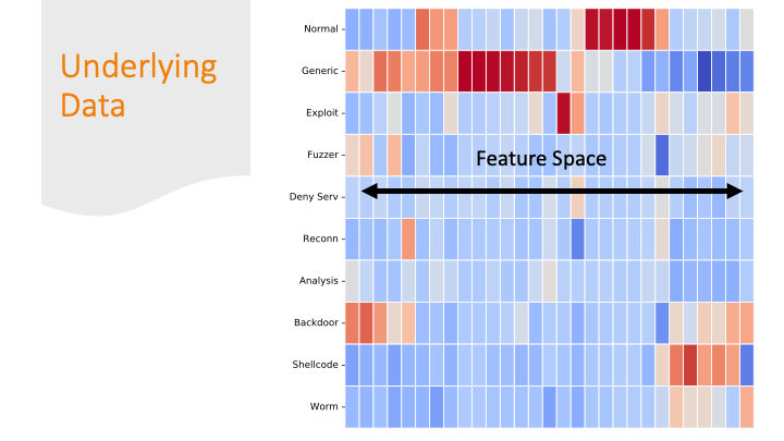
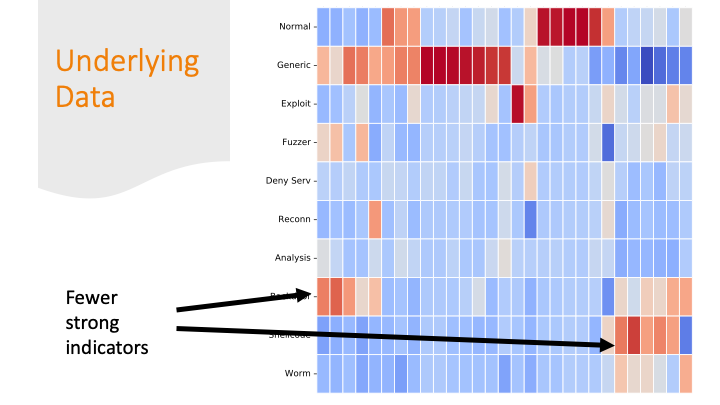
Cluster maps are cool! But, again for a general audience, I needed
to explain them more conceptually, so I did it over several slides…
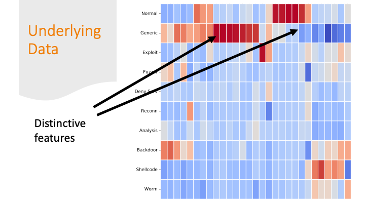
Each feature was colored by skew. Some features had strong positive
or negative skew only for certain labels. That made it easier
for a machine learning algorithm to classify them correctly.
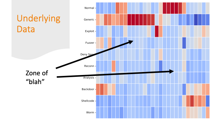
But there are also labels where the colors are all “blah.”
If there are only subtle differences in
the distributions of the feature values between one row and
another, it’s going to be harder for a program to get the labels correct.
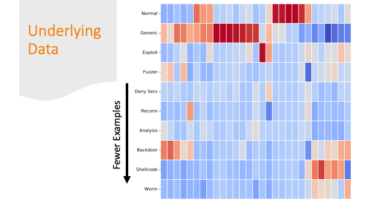
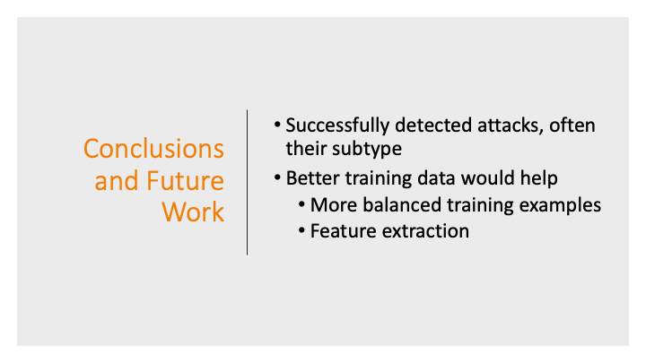
The last slide I briefly mentioned over-fitting. It is likely
my model over-fitted on just on these
last labels, because the dataset had only a few training examples
for these last categories and only a few features are distinctive.