Metis Final Project
For my final project at Metis, I worked on a dataset for detecting network intrusions.
By the end of the bootcamp, I was starting to get good at designing a presentation PowerPoint… or at least at letting the auto-design feature of PowerPoint design a presentation for me. My intruder looks too well-dressed, though. Maybe he’s an FBI agent trying to catch the hacker?

One of the key things the bootcamp emphasized was not to bog down a general audience with too many technical details, so I didn’t get into TCP packet types and fields. I motivated the talk with some examples of recent network breaches. There were/are too many stories to choose from.
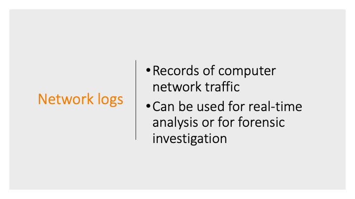
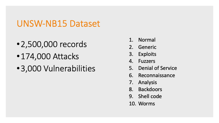
And explained generally what network logs were and where my data came from.
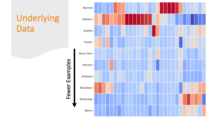
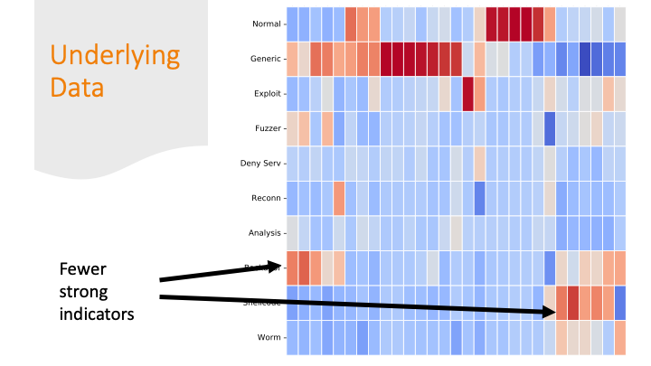
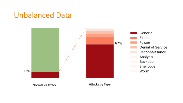
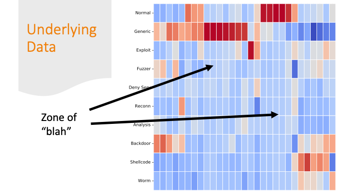
This was a challenging graphic to make with my newly minted matplotlib skills! The dataset was twice-imbalanced. The normal data versus attack data was imbalanced, and then within the attack data, the types of attacks were also imbalanced.
To deal with the imbalances, I used two classifiers: one that separated attack from non-attack, then a second classifier took the attack output and applied a label.
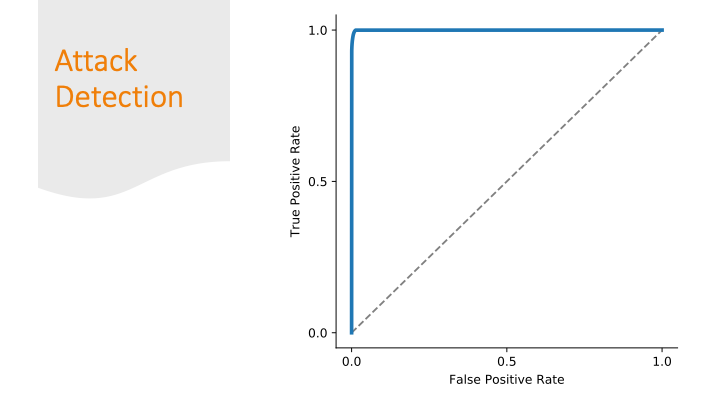
Every classification report needs a ROC curve
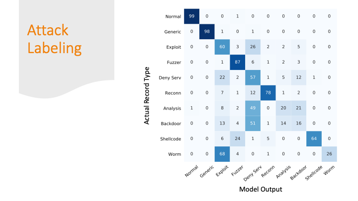
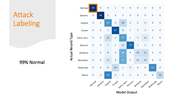
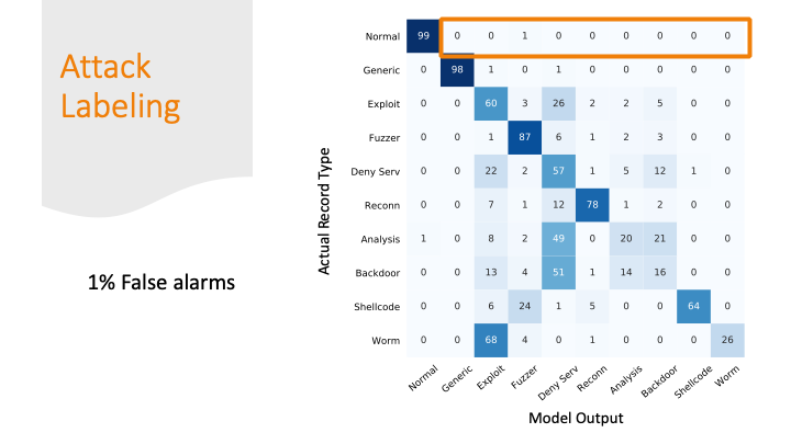
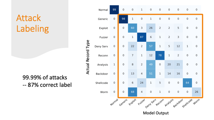
The advisors recommended not doing the confusion matrix because it is overwhelming with so many labels, but I didn’t really find a better way to summarize my results graphically. So, I broke the matrix down over a few slides.
I was able to classify 99% of the normal traffic as normal traffic.
But I marked 1% of normal traffic as an attack. This sounds good percentage wise, but if you think about the number of packets flying across the internet every day, this would be a lot of false alarms!
The attacks were mostly labeled as some kind of attack, but only 87% of the attacks got the correct label.
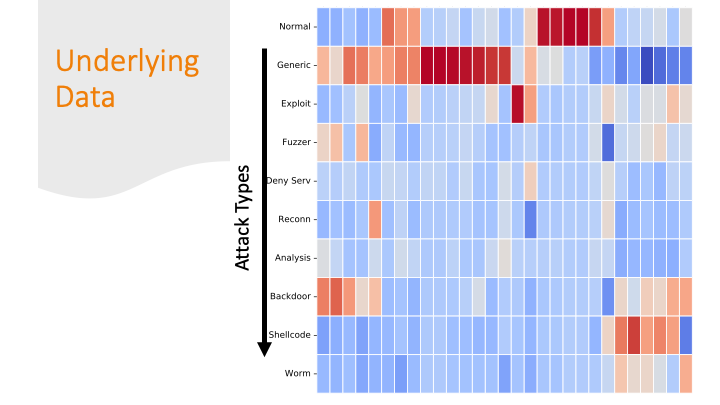
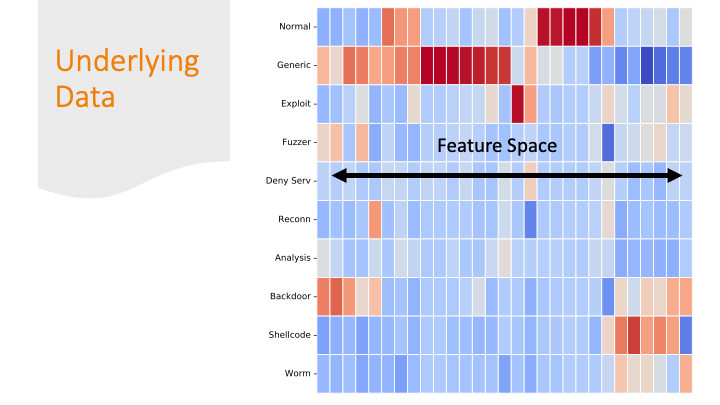
Cluster maps are cool! But, again for a general audience, I needed to explain them more conceptually, so I did it over several slides…
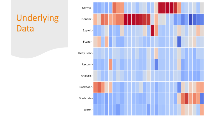
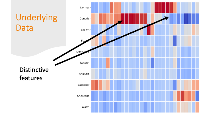
Each feature was colored by skew. Some features had strong positive or negative skew only for certain labels. That made it easier for a machine learning algorithm to classify them correctly.
But there are also labels where the colors are all “blah.” If there are only subtle differences in the distributions of the feature values between one row and another, it’s going to be harder for a program to get the labels correct.
The last slide I briefly mentioned over-fitting. It is likely my model over-fitted on just on these last labels, because the dataset had only a few training examples for these last categories and only a few features are distinctive.