Look at the forest!

Summary
When faced with a big data set, it was tempting to try to break it down into smaller pieces. It turns out, data cleaning can be easier when you look at the forest rather than the trees.
About the project
Our first class project was a group project, and I was teamed with Mailei and Michael.
The data was MTA subway usage data from New York City. The data was collected from counting devices on subway entry and exit turnstiles every four hours for one year. There were over 10 million rows of data in the intial dataset.
We quickly reduced that to 2.3 million rows by focusing on the months of interest in the problem statement. While Michael worked on figuring out the geographic scope, I was working on cleaning the remaining data, which is what I will describe below.
What could go wrong?
In theory, the data was supposed to be counter readings at four hour intervals, but in practice there were some messy rows.
-
Data could be over- or under- collected.
The data included instances where multiple observations were just minutes apart, and other cases where there were one or more missed observations in a sequence leading to intervals that were more than 4 hours apart, up to 24 hours.
-
Counters could behave in unexpected ways.
- A counter which was incrementing in small amounts each day could suddenly reset to zero. If a counter was at a million then suddently reset, the daily increment would be an unbelievable number of entries or exits at that turnstile.
- A subset of the counter population appeared to be counting backwards, decrementing instead of incrementing each day.
The wrong way
Our team wasted time breaking the data down into really small subsets (like one station for a few weeks). After getting a good night’s sleep, I cleaned the dataset in about an hour by working on the entire 2.3 million rows, rather than taking it one piece at a time.
Why did working on the “forest” rather than the “trees” work so well?
-
With a single station’s worth of data, it’s harder to recognize whether an observation is a problematic outlier or just on the high or low end of normal. With more observations, it’s much easier to be confident when you decide an outlier does not belong in the dataset.
-
I knew theoretically that real-world datasets often follow specific statistical patterns, but I wasn’t thinking about that enough when I first started mucking with the data. Only when graphing a large number of observations did the dentisity plots actually smooth themselves out enough to match what you might see in a statistics texbook. And, once I got a plot that matched an appropriate statistical model, I could be confident that my cleaning work was correct and done.
Read on to see examples of what I mean!
Cleaning up time deltas
The observations are supposed to be evenly spaced every four hours. Here is a KDE plot of the uncleaned 2.3 million rows:

You can read this as - a cluster of small outliers on the left, a whole lotta nothing, then a chunk of data where it’s “supposed to be” at four hour intervals on the right.
What do you need to do with this? Just figure out where that bump on the left is! You don’t need to know which stations or which months this happened or why it might have happened. You just need to find it and get rid of it.
I iteratively guessed smaller time amounts until I got a graph of that set of small outliers with the spike right in the middle. And that’s where I cut off the bad data.
Here is the zoom in on the observations that are three minutes apart or less.

I cut those off. Note: I discovered as I was making a graph for this blog post that I didn’t actually cut off enough, as there was another spike after that guy. I should have just chopped the data in the middle of that “whole lot of nothing” range. I guess I was squeamish about chopping off too much data, but 1700 rows out of 2+ million really doesn’t make a difference in your final statistics.
On the other end, The data with large time intervals wasn’t just dropped. The passenger entry and exits counts were flagged as nulls because they weren’t for the correct time interval, but the counter values were kept to keep the subequent observations on track.
Cleaning up the passenger enty/exit data
Cleaning up the time deltas was easy once I understood what to do, expecially since I knew the answer was supposed to be “four hour intervals.”
The entry and exit counter data values were much more diverse, and I didn’t know the right answer. In fact, I was very caught up in the idea that the right answer varied by individual train stations. (Surely some places and days were busier than others.)
The initial graph wasn’t as helpful. Plut or minus two billion? I suppose, it makes sense that the data is clustered right in the middle of that range, but it’s not a particularly helpful insight..

I decided to start with just looking for the outliers on the high end of the scale and hit upon the pandas quantile method. I started at the the 99th percentile and kept adding nines.
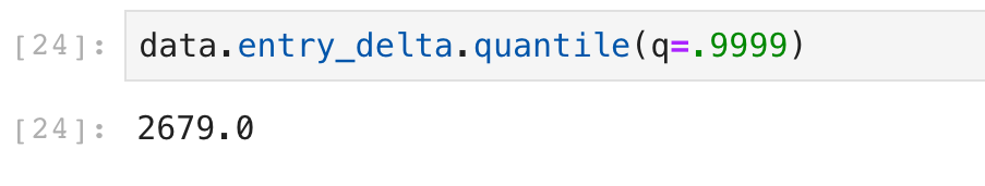
Sure, 2700 people could probably go through a single subway turnstile in a four hour period. That’s busy, but averages out to over 5 seconds per person to get through the doorway.
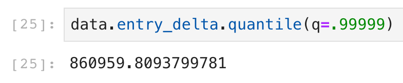
Nope! Definitely found the boundary between good and bad data here.
We added a (possibly too?) generous 50% margin to that ~3000 value and cut off every counter reporting more than 4500 observations.
The smaller negative values were simply flipped to positive and assumed to be counters running backwards.
And then I graphed it.

It’s the Poisson distribution!
Every statistics textbook ever written has a problem about Poisson arrivals at a train station and a picture of a graph like that one.
And it was Poisson any which way you wanted to look – Just graph data at one station? Poisson. Or subset further to just one day of the week? Poisson. The smaller the data set size, the more jitters in the curve, but it was unmistakeably Poisson.

OK, proof that I’m a nerd, but that was my big accomplishment for the first week of boot camp.
I learned to get out from under the trees and look at the forest.